
Warner Bros.
ABOUT
Warner Bros.' Global Insights & Analytics department turned research and data into stories people could act on. The team studied audiences, markets, and performance across the studio's slate, and its findings shaped decisions from development through distribution.
Its in-house Presentation & Design Services group made those insights clear and compelling. This small team of a VP, an Art Director, and designers worked side by side with the Insights & Analytics researchers. Together they built forward-thinking animated presentations, print and digital communications, mock-ups, and the occasional filmed focus group. They also trained the insights and sales teams to use these visual tools well, so every presentation reached stakeholders with the same polish and precision.
The department combined analytical rigor with a real passion for design: color, typography, layout, animation, photography, and illustration. It was a place where data met craft, and where both the creative and the strategic sides of the work got equal attention.
ROLE | GRAPHIC DESIGNER
As a designer on the Presentation & Design Services team, I turned research and data into sales and distribution presentations built to persuade. I worked across a wide range of Warner Bros. divisions, including DC, Domestic TV Distribution, Telepictures, Non-Scripted TV, Digital & Ad Linear Sales, CNN, HBO Max, Motion Pictures, Home Entertainment, Network TV, Corporate Initiatives, Consumer Products, and TCM. The finished materials went to executives, buyers, stakeholders, and ad sales teams, often in high-stakes settings.
Much of my work focused on data visualization. I designed infographic-driven decks that made complex research easy to read while staying true to each brand's identity, whether it was a streaming service, a network, a TV series, or a feature film. To help teams move faster without losing polish, I also built flexible presentation templates from key art for shows, networks, movies, and streaming platforms.
Departments
HBO, HBO Max, Warner Bros., TNT, TBS, truTV, CNN, DC Entertainment, New Line, Cartoon Network, Adult Swim, Turner Classic Movies and others.
SCOPE
Audience
Executives, internal stakeholders, Licensing partners & retailers, buyers & ad sales teams
Tools
PowerPoint / Keynote, Illustrator, Photoshop, InDesign, After Effects, Excel
THE DATA PROBLEM
The research teams at Warner Bros. produced excellent data: ratings, audience demographics, streaming performance, box office and ad reach. It was accurate and thorough.
It was also dense. It came to me as tables with dozens of rows, slides packed edge to edge with numbers, footnotes stacked on footnotes, and every metric given equal weight.
Researchers are experts at finding the insight. Their job isn't to sell it. The decks were built to be complete, not persuasive.
My job was to find the story hiding in the data and make it impossible to miss.
I was the bridge between data & storytelling. I took raw research & information from teams across many divisions and turned it into clear, branded visual stories that executives, buyers and ad sales teams could use in the room.
TURNING DATA INTO STORY
*Data & numbers have been modified for confidentiality
1.
Start With the Raw Deck
Research teams handed me unstyled decks: plain pages full of charts, tables and notes. I read through every page first to understand what the data was trying to say before designing anything.

Find the Theme
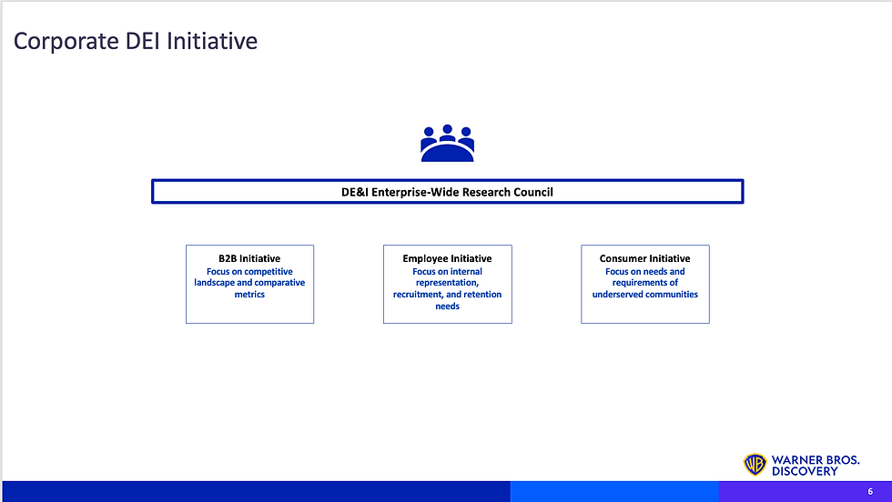
Every deck had its own subject: streaming performance, DEI, how specific shows performed, audience demographics and more. I identified the core theme and let it guide the look, tone and structure of the whole presentation.


2.


Build the Foundation
I designed the master pages and theme (layouts, type, color and grids) so every slide shared one clear, consistent structure.
Create a Visual Language
I designed recurring visual elements, such as icons, color coding and section markers, that carried through the entire deck. Viewers could instantly recognize which topic, show or platform was being referenced on any slide, without having to read the label.


3.
4.


Rebuild the Charts & Add Infographics
I redesigned every chart in the format that best showed the information: lines for trends, bars for comparisons and part-to-whole visuals for audience share. Where a chart alone wasn't enough, I designed infographics that made complex findings easy to understand at a glance.
Review the Flow
Finally, I reviewed the full deck from start to finish to make sure every slide made sense, the order built a clear story, and the data stayed accurate.


5.
6.


TAKEAWAY
Data doesn't speak for itself. Someone has to translate it. The researchers found the truth, and my job was to make people care about it. The best data slide isn't the one with the most numbers. It's the one where the room gets the point in five seconds.